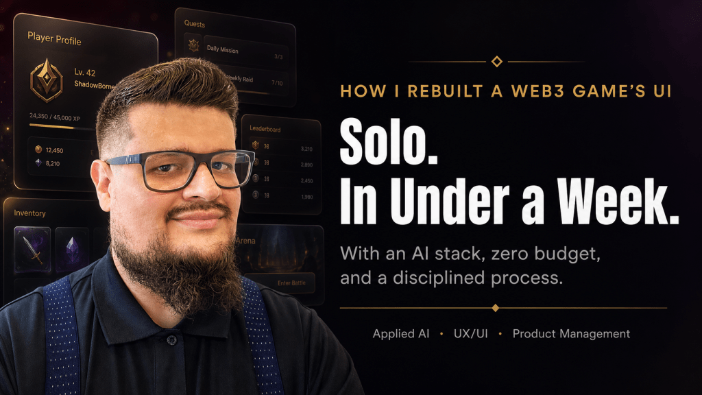
There’s a belief in many product teams that quality UI/UX requires a dedicated design agency, a multi-month timeline, and a substantial budget. I want to challenge that belief — not with theory, but with a real story of what I shipped last week.
I delivered a full UI/UX overhaul of a Web3 real-money betting platform — from a generic, functional interface to a modern, glass-effect UI with a complete design system, pixel-level animation specifications, and accessibility compliance. I did it in under a week. I did it alone. And the total cost of tooling was zero dollars.
Here’s exactly how I did it, and more importantly, the process behind it — because the tools are available to anyone. The differentiator is knowing how to use them.
The Product: A Web3 Betting Platform
The platform is a mobile-first, real-time multiplayer game where players compete and wager cryptocurrency. Think of it as a skill-based betting arena — players join tables, place bets in USDC, and the smart contracts handle settlement. The target audience is mobile-first, often on constrained bandwidth, and emotionally invested in the experience. This is not a product where “good enough” is acceptable: real money is on the table.
The tech stack was Next.js 14 with Tailwind CSS, deployed on Vercel, targeting 390px-wide screens. The existing brand had two anchor colors — a deep maroon (“felt”) and a gold — with distinct typography families already configured. The constraints were real: zero additional tooling budget and a small, agile team supported by AI agents filling specialized roles (design, growth, product operations, game logic).
The UI, frankly, did not match the ambition of the product. Cards felt small on screen. The game state was static — no animation communicated cause and effect. The lobby was a plain list. The login screen was generic. The experience didn’t make players feel like they’d arrived somewhere.
That gap between a great product vision and a mediocre interface is exactly where I like to work.
Phase 1: Building the Intelligence Layer Before Writing a Single Line
The first insight that separates modern AI-assisted development from prompt-and-pray is this: you must give your AI stack domain knowledge before you ask it to create anything.
Most developers skip this step and wonder why Claude or Copilot keeps generating generic, AI-slop UI. The answer is simple — the model has no persistent knowledge of your brand, your audience, your constraints, or your aesthetic intent. Every session starts cold.
My solution was to install a curated stack of Claude Code Agent Skills — open-source, MIT-licensed intelligence modules that give Claude persistent, specialized context. These aren’t plugins in the traditional sense; they’re structured knowledge directories that Claude loads on-demand when it detects a relevant task. Installing multiple skills doesn’t bloat every prompt — the model reads only the name and description (~100 tokens each) at session start, and pulls the full instructions only when the task matches.
The skill stack I assembled for this project covered four layers:
- Design intelligence — UI/UX Pro Max 67 UI styles, 161 color palettes, 57 font pairings, 99 UX guidelines, and card-game mobile patterns. This became the primary creative engine.
- Quality gate — Vercel Web Design Guidelines: 100+ auditable rules covering accessibility, ARIA, touch targets (minimum 44×44px), responsive UX, and keyboard support. This replaced the need for a manual QA pass.
- Performance layer — Vercel React Best Practices: 64 rules across waterfall elimination, bundle size optimization, and re-render control. Critical for low-bandwidth users — every millisecond of load time matters when your audience is on 3G.
- Workflow layer — GStack by Garry Tan: 28 slash commands including /design (a designer-persona review of any component) and /browse (a real Chromium browser with screenshots for visual QA). This closed the feedback loop without needing a separate person.
I also added the Anthropic frontend-design skill for new section creation — specifically engineered to produce distinctive, non-generic outputs — and AccessLint for contrast checks against the maroon/gold palette.
All skills were committed to the project’s .claude/skills/ directory and pushed to Git. Every agent in the team who opened Claude Code inherited the same intelligence layer automatically.
This is the step most people skip. They ask an AI to design a screen with zero context and then complain the output looks like every other SaaS landing page. Feed the model your brand, your constraints, your audience. The output quality difference is not incremental — it’s categorical.
Phase 2: The Design System as a Living Contract
Before touching a single screen, I ran the second foundational step: generating a persistent design system.
UI/UX Pro Max supports generating a design-system/MASTER.md file — a living source of truth that Claude reads automatically on every UX-related task in the session. I prompted it with the full brand context: maroon felt table aesthetic, gold typography, mobile-first 390px, real-money game, Venezuelan cultural context, dark background.
The output was a structured token system covering global palette, typography scale, spacing units, animation timing curves, and UX principles anchored to the specific product. I reviewed it, made manual adjustments to tighten the brand voice, and committed it to the repository with a single CLAUDE.md instruction: “Always consult design-system/MASTER.md before generating or modifying any UI component.”
From that point forward, every component Claude generated had consistent color tokens, consistent spacing, consistent motion curves. The model wasn’t making creative decisions in a vacuum — it was executing within a defined system.
This is standard practice in mature design organizations. What’s new is that a solo product manager can now generate, own, and maintain this system in a single working session, without a dedicated design team.
I then ran a formal audit of the existing components using the Vercel Web Design Guidelines skill, producing a file:line issue list across the five most critical components: the core game screen, the challenge/response interaction bar, the turn timer, the challenge announcement banner, and the game-over settlement sheet. The audit surfaced concrete, actionable issues: touch targets below 44px on challenge buttons, contrast violations in the gold-on-dark palette, missing ARIA labels on game-state announcements, and animation timing that felt abrupt rather than intentional.
This is agile product management applied to design: you don’t redesign everything; you prioritize the highest-impact issues and address them systematically.
Phase 3: Screen-by-Screen Execution
With the design system committed and the audit complete, I broke the redesign into discrete, independently deployable tickets. Each ticket had a clear scope, a design brief from the UX design agent, and a definition of done that included visual verification via /browse. This is important: breaking work into small, reviewable units is not bureaucracy — it’s how you maintain quality at speed.
The Login Screen — First Impressions Are a Product Decision
The login screen was the first ship. The design brief was simple: full-bleed felt-texture background, a card fan illustration using the platform’s custom illustrated deck, the app logo at generous scale, a single-field minimal form, and a gold CTA. No guest mode. No distracting chrome. Authentication is always required — so the login screen is the first product experience.
The custom card illustrations — a full illustrated deck designed for the platform — became central to the identity. Cards aren’t decoration; they’re the product. Every screen decision was made in service of making the cards feel premium, alive, and proud.
The Lobby — From a List to a Table Browser
The lobby redesign replaced a plain list with card-based table browsing. Each table is represented as a glass-morphic card with the bet range displayed as a prominent gold badge — the most important information, most visually prominent. Player count and availability are visible at a glance. A floating action button for “Create Table” stays accessible regardless of scroll position.
The glassmorphism — frosted transparency with subtle blur and border glow — became the signature aesthetic of the redesign. Applied consistently across lobby, profile, and utility screens, it communicates depth and premium quality without the heaviness of skeuomorphic design. It’s modern without being sterile.
The Game Screen — Where the Product Lives
The game screen received the most intensive treatment, because it’s where players spend the vast majority of their time and where the stakes are highest. The guiding principle was simple: cards own 60% of vertical space.
The existing screen had card sizes designed for desktop rendering — on a 390px mobile screen, the illustrations were too small to appreciate and the touch targets were too small to use confidently. I specified concrete targets: player hand cards from ~60px to 100–110px wide, played cards in the center zone from ~70px to 120–130px — the visual anchor of the entire screen. The card aspect ratio was maintained at 2:3, letting more of the illustration become visible.
The animation system was specified with the same precision as the layout:
| Event | Duration | Easing |
| Card dealt to hand | 250ms | cubic-bezier(0.16, 1, 0.3, 1) |
| Card played by player | 300ms | Spring |
| Card played by opponent | 350ms | Spring |
| Canto challenge issued | 400ms | Ease-out |
| Score update | 300ms | Linear |
| Game over reveal | 600ms | Spring |
Every animation is opt-outable via a global accessibility/low-bandwidth toggle in settings — a detail that matters for the target audience and for WCAG compliance.
The card play interaction was simplified to a single swipe-up gesture. One fluid motion plays the card immediately — no tap-tap confirmation, no friction between decision and action. In a real-money game where hesitation has cost, every unnecessary step is a design failure.
The Profile and Utility Screens — System Consistency
The profile screen, the rules screen, and the table creation flow were redesigned to consume the same glass card visual language established in the lobby. This is where a design system pays its dividends: once the tokens and patterns are defined, applying them to new screens is fast and consistent. The profile screen surfaces player stats, preset avatar, game history, and the animations toggle. The rules screen, previously in a pre-redesign style, was brought into full consistency in a single ticket. The table creation flow received an end-to-end glassmorphic treatment including the waiting room and bet confirmation.
Navigation — Invisible Infrastructure
The bottom navigation was gated behind what the team called the “Truco Loader” — a branded fullscreen loading state triggered by every tab navigation, with a code-enforced 500ms minimum regardless of actual load speed. This detail sounds minor. It isn’t. It ensures that players never see a partially loaded state; every screen transition feels intentional and complete. The polish is in the details that users notice without knowing why.
The Agile Architecture Behind It
The full execution happened across two epics and thirteen discrete tickets, all tracked in Linear. Epic covered the skills installation, design system generation, and component audit. Epic 2 delivered the full screen-by-screen redesign.
Both epics reached Done status. Epic 1 from creation to completion: roughly one day. Epic 2: three days. Total wall-clock time from initial planning document to shipped redesign: under a week.
Each ticket was independently deployable. Each had a clear owner (the engineering agent), clear design specs from the UX design agent, and a clear acceptance criteria. The product management layer — prioritization, sequencing, scope management, decision logging — was handled by me.
This is the model I believe in: small humans, big agents, disciplined process. The agents don’t replace judgment — they amplify execution. The open questions in the epic (portrait vs. landscape? swipe-up or tap-tap? preset avatars or custom?) were answered by humans based on product strategy and audience understanding. The implementation was handled at speed by the AI stack with human review at each ship point.
What This Means for the Industry
There are no more excuses for shipping mediocre product interfaces.
The tools to produce WCAG-compliant, brand-coherent, animated, mobile-optimized UI exist, are free, and are installable in minutes. The process to use them well — design system first, audit second, targeted improvement third — is learnable in a single sprint. The gap between what most teams ship and what is now achievable is a process gap, not a capability gap.
What I’ve described here isn’t a shortcut. It’s a disciplined methodology for applying the best available tooling in sequence: intelligence layer → design system → audit → execution → visual QA. Every step is deliberate. Every output is reviewed. The AI amplifies the execution; the human owns the strategy and the taste.
The teams that will win in the next three years are not the ones with the biggest headcount. They’re the ones who build the smallest, most capable human layer on top of the most powerful AI stack — and who run that stack with the same rigor they’d apply to engineering systems.
A solo product manager can now do what used to require a full design and frontend team. I know, because I just did it.
If you found this useful, I write about applied AI, product management, and building with modern tooling at the intersection of Web3 and consumer products. Connect with me on LinkedIn — I share the process, not just the outcome.
 John De Goes’ blog
Leave a comment